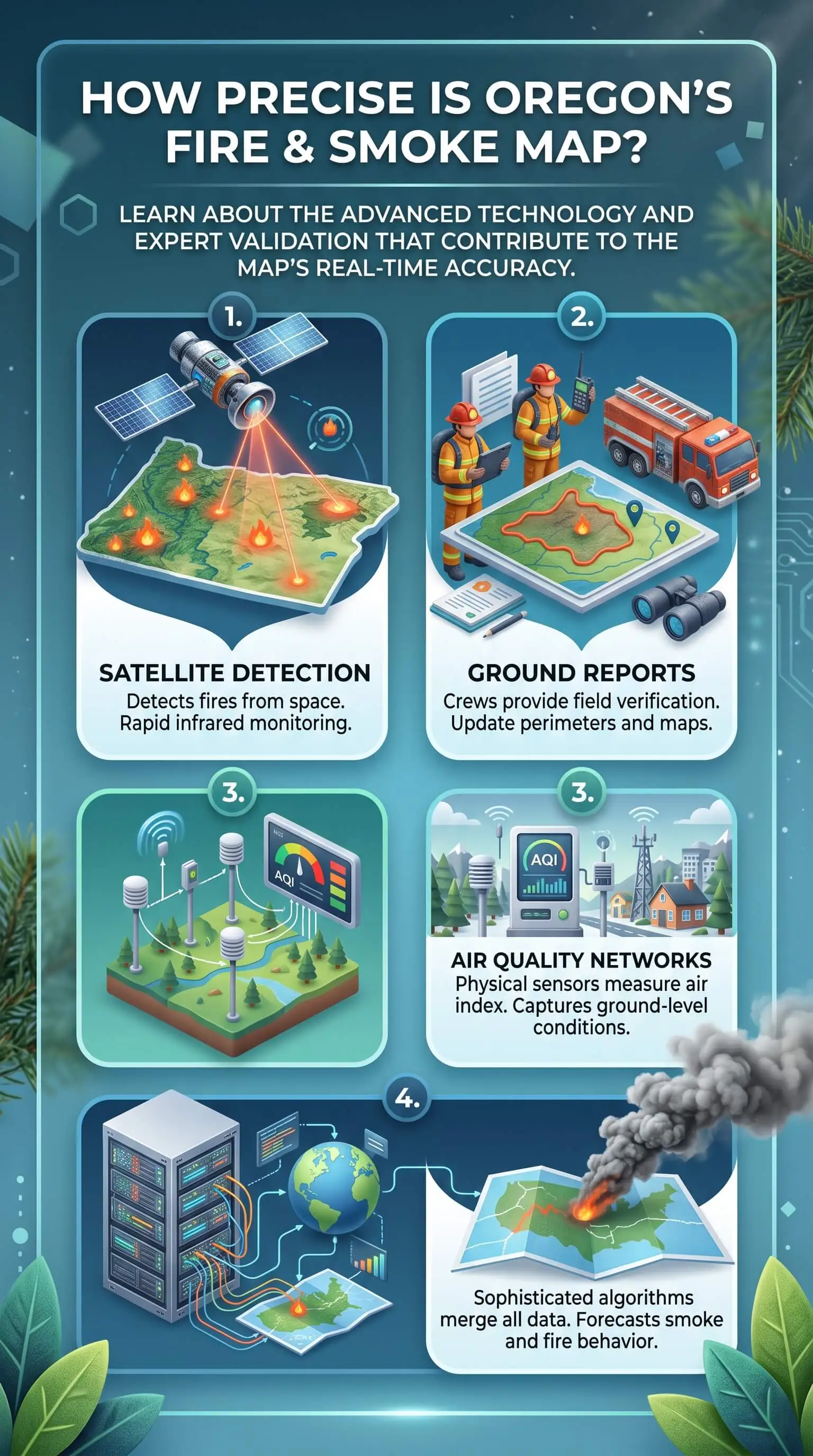
Corrected smoke sensors on Oregon’s fire and smoke map land in the same air quality category as official monitors about 94% of the time. So yes, the smoke map Oregon families pull up every summer is accurate enough to plan your day around. The catch is knowing which layer you’re reading, because agency monitors, backyard sensors, satellite plumes, and fire icons all share one screen and each one measures something different.
Smoke here doesn’t sit still. On east-wind days the Columbia River Gorge funnels it west, and valley floors hold it close to the ground overnight. A sensor a few miles away can be sitting in completely different air than you are. I checked these maps all season, and they finally clicked for me once I learned what each icon measures and how old its data is.
TL;DR Quick Answers
Smoke Map Oregon
The main smoke map for Oregon is the AirNow Fire and Smoke Map, run by EPA and the U.S. Forest Service. It layers Oregon DEQ monitors, corrected low-cost sensors, NOAA satellite smoke plumes, and active fire incidents on one screen. Corrected sensors match official monitors' AQI category about 94% of the time.
Trust monitors first: Oregon DEQ runs more than 40 monitoring sites, and the nearest one on the DEQ Air Quality Index page or OregonAir app is your most reliable reading.
Cross-check nearby sensors: When two or three agree, trust the pattern. A lone outlier is usually a placement issue.
Read plumes as a heads-up: Satellite smoke can sit far above ground level, so confirm with ground readings before you act.
Check the timing: The NowCast averages the last 12 hours, while the sensor trend covers the past 30 minutes.
Protect your home when it turns orange: Close windows, set your HVAC to recirculate, and run a MERV 8 filter or the highest rating your system can handle.
Top Takeaways
Monitors come first: agency monitors set the standard, and the map corrects sensors to match them.
Sensors run close: corrected sensors land in the same AQI category as monitors about 94% of the time.
Plumes can sit high: satellite smoke doesn’t always reach the air at ground level.
Terrain shifts readings: Gorge winds and valley inversions create big differences over short distances.
Your home is the shield: recirculate, run the fan, and use the highest MERV rating your system can handle.
What the Map Is Actually Showing You
Every icon on the map answers its own question. Mixing them up is where most bad reads start.
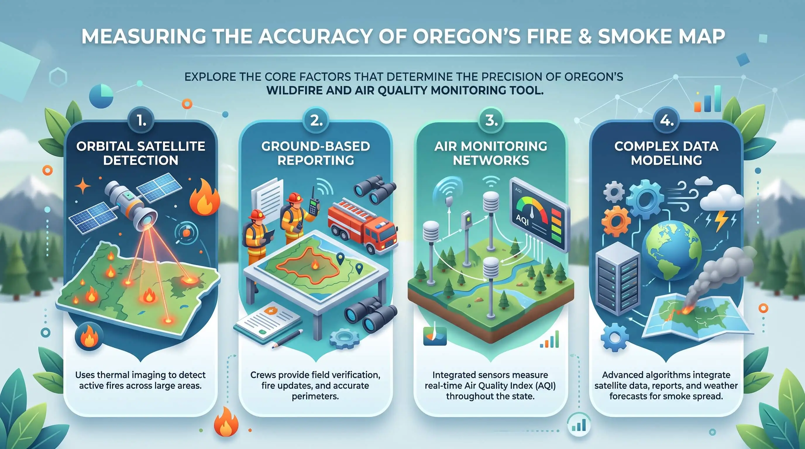
Agency monitors. These set the reference standard. Oregon DEQ runs monitoring equipment at more than 40 sites across the state, and their numbers are the ones I trust first.
Air sensors. Everyday people own most of these, with PurpleAir leading the count. You’ll also spot Clarity sensors and Oregon’s own SensOR network, which the map currently shows in a provisional status.
Fire icons. Large incidents come from the National Interagency Fire Center feed. NOAA supplies the satellite fire detections.
Smoke plumes. NOAA analysts outline these from satellite imagery through the Hazard Mapping System.
Why Sensor and Monitor Readings Disagree
Small gaps between a sensor and a monitor are normal, because the two tools measure smoke in different ways. A low-cost sensor estimates particles from the light bouncing off them. It also pulls less air than an agency monitor and never dries the sample first. Left uncorrected, PurpleAir sensors follow the same ups and downs as monitors, yet they tend to read high and stop responding in a straight line once smoke gets very heavy.
EPA and the Forest Service clean up that data before you ever see it. They drop sensors labeled as indoor units, toss readings whenever a sensor’s two internal channels disagree, and run the rest through a U.S.-wide correction equation. That cleanup is why a sensor on the smoke map often shows a lower number than the same sensor on its maker’s website.
A few problems still get through. Sensors undercount dust, and nobody checks where owners mount them. Put one beside a backyard fire pit or a busy road and it will report on that fire pit or road rather than the regional smoke drifting through your neighborhood, which is why top air filters can still matter indoors even when outdoor sensor readings look manageable.
How Fresh Is Each Layer?
Most of the confusion I hear about comes down to timing. Each layer runs on its own clock.
NowCast AQI: a weighted average of the last 12 hours that leans hardest on the most recent ones.
Sensor trend: 10-minute averages covering the past half hour, handy for quick calls like whether to crack a window.
Smoke plumes: refreshed every few hours. Satellites lose them at night and under cloud cover. Some also float far above the ground.
Fire incident details: these can run several days behind, depending on how agencies report each incident.
Oregon Terrain That Changes What the Map Shows
Oregon’s landscape can split one region into very different air days. When east winds push through the Gorge, smoke can reach Portland and the north Willamette Valley within hours. Overnight inversions in the Willamette, Umpqua, and Rogue Valleys pin smoke near the ground until the air mixes out late in the morning. East of the Cascades, sensors thin out. Your closest reading there may sit many miles away.
Smoke also rides in from Northern California and Washington. A live wildfire and smoke map for Oregon that layers fire detections under smoke plumes makes it easier to tell whether a spike started nearby or arrived from another state.
A Simple Way to Verify Before You Act
Treat any single icon as a first clue. Here’s the routine I follow before I decide anything.
Find the nearest agency monitor on the DEQ Air Quality Index page or in the OregonAir app.
Compare two or three nearby sensors. When they agree, trust the pattern. When one stands alone, it’s probably the outlier.
Lean on the 30-minute trend for quick decisions and the NowCast for planning your day.
Read plumes as an early warning, then confirm with ground readings.
Go by the AQI rather than smell or sky color, and look again once inversions lift in late morning.
What Smoke Readings Mean for Your Home’s Air and Ducts
Once the map turns orange near you, your HVAC system becomes your family’s first line of defense, and you’re the one running it. CDC guidance calls for a MERV 13 filter or higher if your system can handle one, along with recirculate mode or a closed outdoor air damper.
Keep windows and doors shut, and set the system fan to run so more air passes through the filter.
During long smoke stretches, check the filter every week or two. Gray media or weaker airflow means it’s time for a fresh one, whatever the calendar says.
After a heavy season, have someone inspect the return ducts and blower. Fine smoke residue can settle in both, and an inspection tells you whether cleaning is actually needed.
“In my years reviewing smoke data, the mix-up I see most often is people treating a light-scattering sensor and a filter-based monitor as the same instrument. The sensor has to translate scattered light into mass, so when a plume moves fast it can briefly land in a different AQI category than the monitor down the road, making top duct cleaning worth considering as part of keeping indoor airflow and filtration working effectively during smoke events.”
7 Essential Resources
Live Wildfire and Smoke Map for Oregon: fire detections and smoke plumes in one statewide view.
AirNow Fire and Smoke Map Questions and Answers: how the map handles sensors, monitors, and plumes, and where each one falls short.
EPA Technical Approaches for Sensor Data on the Fire and Smoke Map: the correction and approval steps sensor networks go through before they appear.
Oregon DEQ Air Quality Monitoring: the state network, its sensor sites, and the OregonAir app.
NOAA Hazard Mapping System Overview: how analysts build the satellite fire and smoke layer.
CDC Safety Guidelines for Wildfire Smoke: indoor air steps, filter guidance, and respirator basics.
National Weather Service Fire Weather: red flag warnings and fire outlooks that hint at smoke ahead.
3 Supporting Statistics
Corrected PurpleAir readings matched the monitor’s NowCast AQI category 94% of the time, and fewer than 1% missed by more than one category. (EPA-led correction study, 2022)
Oregon logged 2,232 wildfires that burned 1,797,796 acres in 2024, and the Northwest had the most acres burned of any region in the country. (National Interagency Coordination Center 2024 Annual Report)
Three Oregon metro areas rank among the nation’s 25 worst for short-term particle pollution, and Bend posted its worst weighted average on record. (American Lung Association State of the Air 2026)
Together, these statistics show why Oregon households need to take smoke seriously: wildfire activity is intense, short-term particle pollution remains a major issue, and reliable sensor data can help you decide when high quality filters should take on more of the work indoors.
Final Thoughts
In my view, the Oregon fire and smoke map is the most useful free tool a homeowner has during fire season. Most of the frustration people feel with it comes from giving every icon the same weight. Use it as a cross-check instead. Let agency monitors anchor your call and nearby sensors fill the gaps, then watch the satellite plumes for what might roll in next. Read that way, the map deserves far more trust than its reputation suggests, especially when paired with proper duct sizing so your home’s air system can move filtered air effectively during smoke events.
Frequently Asked Questions
Why does the smoke map show a different AQI than my weather app?
Weather apps often pull from one nearby station or a modeled estimate. The smoke map shows a 12-hour NowCast at each individual monitor or sensor, so different sources and averaging windows can give the same neighborhood two different numbers.
Is PurpleAir accurate during wildfire smoke?
Raw PurpleAir readings tend to run high and bend once smoke gets heavy. The versions on the fire and smoke map go through EPA quality checks and a correction first, which brings them close to agency monitors in most conditions.
Why does the map show smoke over my town when the air seems clear?
Satellite plumes capture smoke anywhere in the atmosphere, including smoke riding far above the surface. When the monitors and sensors near you read Good or Moderate, that smoke is most likely aloft and isn’t reaching the air you breathe.
How often does the Oregon smoke map update?
Sensors refresh in 10-minute steps, monitors report hourly, and the NowCast blends the last 12 hours. Satellite plumes update every few hours, and fire incident details can lag by several days, so check the timestamp before acting on any icon.
Can I use the map to decide whether to exercise outside?
Yes, as long as you check the nearest monitor and a few nearby sensors instead of relying on one icon. At Unhealthy for Sensitive Groups or higher, move the workout indoors or cut it short, and keep an eye on the 30-minute trend.
Read the Map With Confidence
The Oregon fire and smoke map is accurate enough to guide your day once you read each layer for what it actually measures. Compare your nearest monitor with the sensors around it, and let that combined picture decide how you run your home’s air system and if air ionizer installation services fit into your indoor air strategy.